WeTravel - Payment Platform
Opportunity: Research, UX/UI Design
Challenge: Create a payment platform for travel web app.
Role: Product Designer

Overview
WeTravel is a payment platform for travel organizers and vendors to collect payments securely and manage bookings efficiently.
When I started the project, Wetravel does not have a payment platform for trip organizers and vendors to make payment. The client would like an end-to-end payment platform flash out with the course of 10 weeks.
I worked with a team of UX designers, by building the vendor payment channel from zero to one, we hope to:
Develop an onboarding platform for the vendors
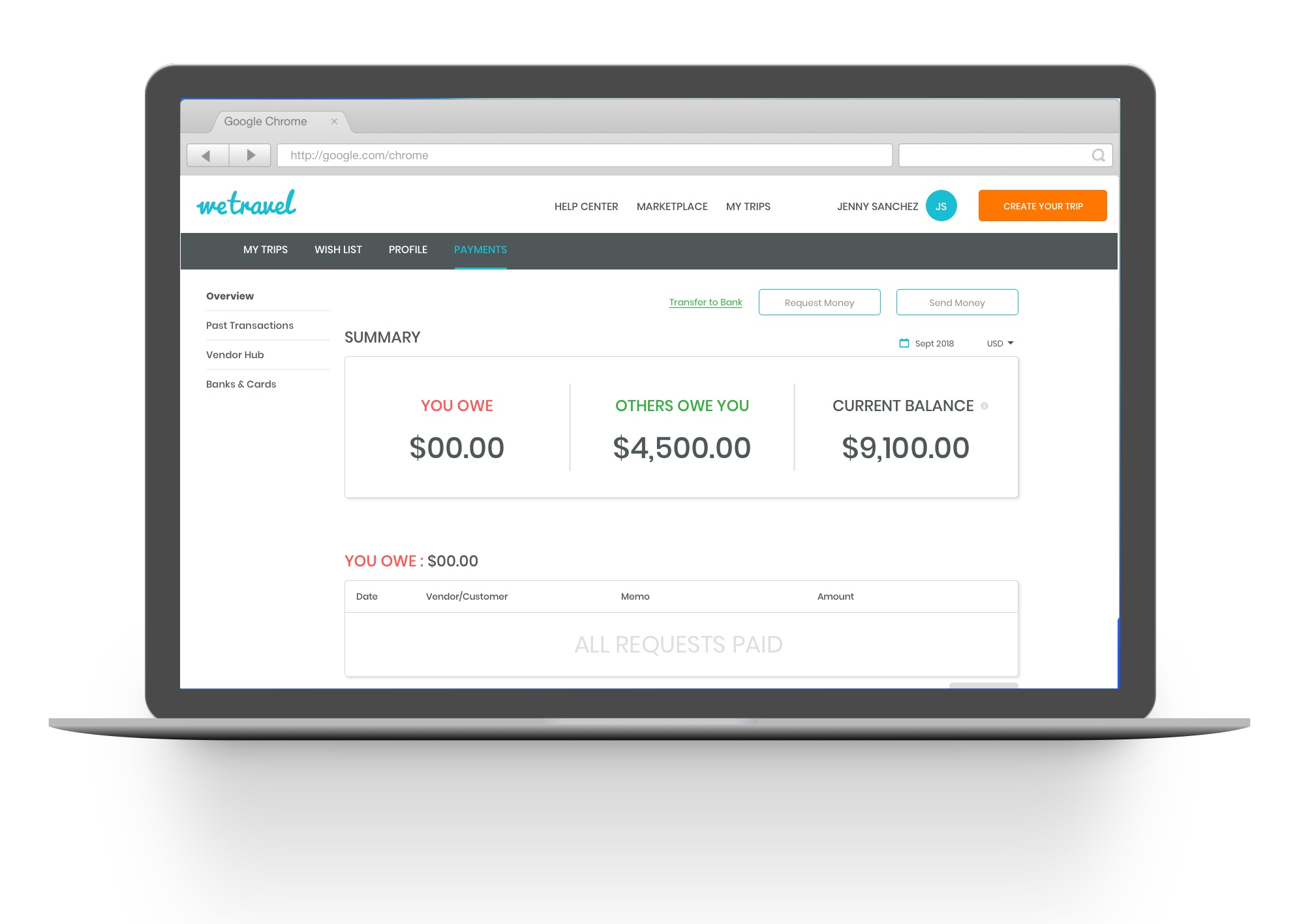
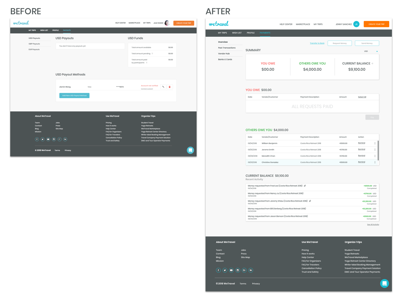
Develop a dashboard allowing users to pay, request, sent payment, as well as provide general account information.
Develop user flow
Create the vendor hub
TL;DR
A quick preview of some screens from the final product.
The Research Process

RESEARCH
Competitive Analysis
The initial step of the research was to understand successful patterns in current products and missing gaps in unique values. As part of the team, I explored 14 different products, and narrowed down to 4 competitor payment platform, and 4 vendor management platform. I analyzed the pros and cons of each competitor, and performed our points of analysis on: payment management, on-boarding, and transaction.
User Testing
We identified there are two use cases for Wetravel. Use case 1 are the people who sent payment, in most cases, it is the organizers sent payment to the vendors. Use case 2 are the receiving money. Organizers receive payment from the vendor.
Learning Goals
These are the learning goals from the two different case study.

SYNTHESIZE
Prioritizing Values
The findings from our research were then organized on an affinity map to better understand their relationship to each other and to determine our priorities moving forward in the process.


POTENTIAL SOLUTION
Feature Overviews
Base on the research above, we concluded that 3 parts need to be created.

Payment system
Design a payment system for Wetravel users to pay their vendors in an inexpensive and seamless way
Acquisition
Attract and acquire new WeTravel users through the use of a “Request Payment” feature for verified vendors.
Vendor Hub
Create a space for Wetravel users to save their vendor’s contact information

Organizers:
To easily pay their domestic and international vendors
To save vendor information for future use
To create custom payment plans for clients and vendors

Vendors:
To get paid via a secure method
To easily view their invoices and payment statuses
THE DESIGN PROCESS

Ideation
Userflow
I love the uphill challenge of brainstorming a user flow from nothing, and this project was particularly engaging because we needed to juggle the vendor and the organizers in one platform.

Initially, we mapped out the main tasks respectively for the organizer and vendor. The main task for the organizer is to send payment to the vendor, while the main task for the vendor is to accept/request payment from the organizer. Quickly, we encountered some setback as the planning got complicated. We realized their unique tasks would require different page views.
Revision
Coming back to the drawing board, we decided that having the same views for the vendor and the organizer is crucial, especially on the main page views. We reworked the flow so the organizer and the vendor would use the page harmonious. We focused on the dashboard to be versatile for both parties.

Design Sprint
We did a design studio to come up with various solutions, which is an intensive process of sketching, presenting, collaborating, and validating among the team. I focused on the dashboard, and the payment flow when uses request payments.
Things we had to consider were: What are the common yet crucial information to show for both vendor and organizer? How many activities would the user interested to see? What information should be included in the summary? What is the visual hierarchy of the information? How would the flow looks like?

LO-FI
Wireframe
While we were sketching out the dashboard, we have to carefully select the functionality and wording.

Above is the design process through the ideation phase. As expected, the process was more of an organic journey than linear path, consisting of constant revisit of the previous steps and reiteration.
TESTING
Lo-fi Testing
We fleshed out the UI sketches, created lo-fi wireframes, and got down the clickable prototype for validation testing.
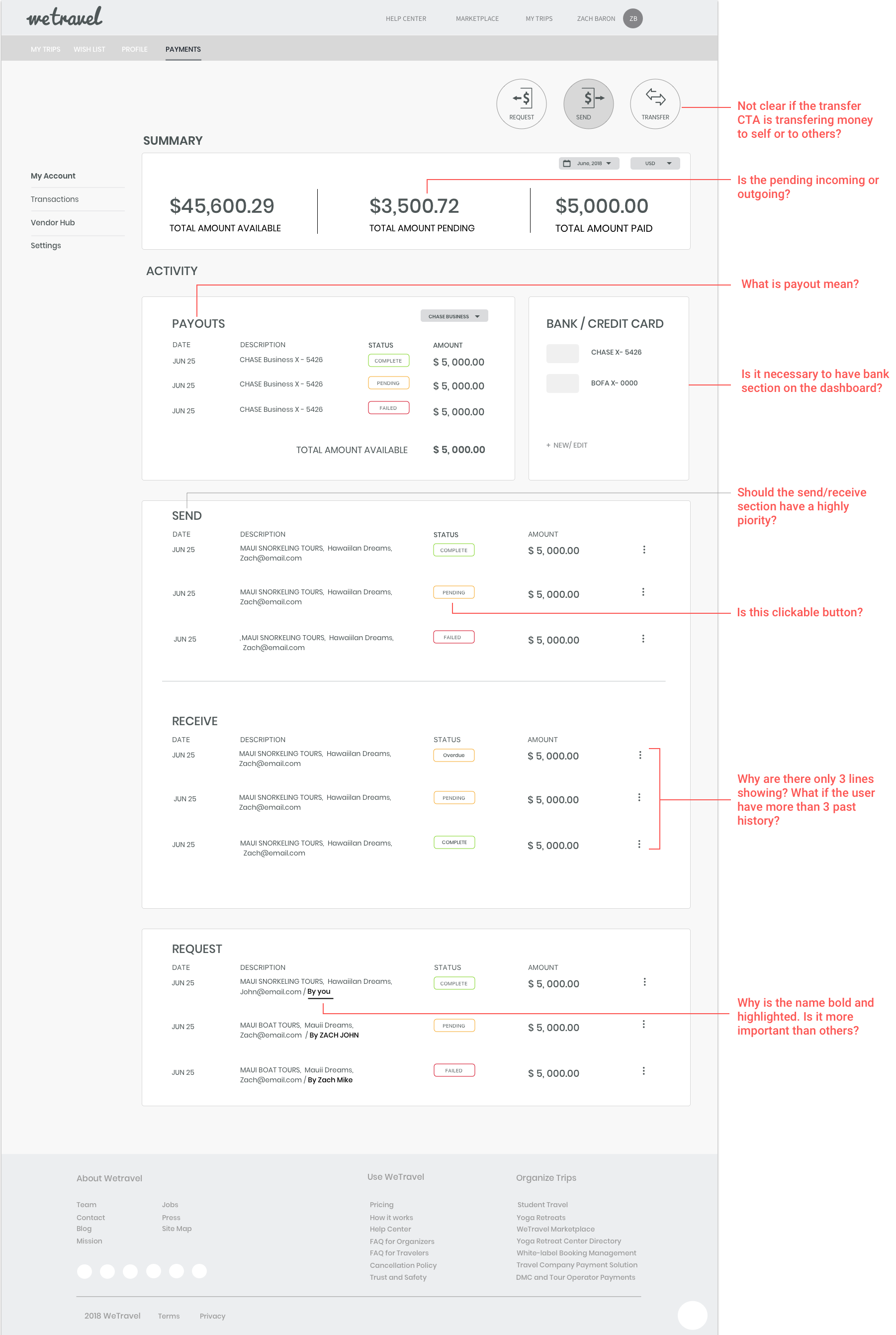
We conducted validation testing with 7 users, and found out there were a couple issues with wording on the dashboard. We had some work to do. Users couldn’t exactly understand what the pending future means. For example, we would like to make the clickable CTA as simple to understand as possible.
SOLUTION
Overview

REQUEST PAYMENT FLOW
VALIDATION
We conducted validation testing of the clickable prototype with 5 users for each group. Here is a summary of the findings from the "buyers" testing:
6/8 Seamlessly checked pending transaction and made payment
6/8 Found information on web pages satisfactory and trustable
5/8 Requested for more information on Wetravel security
6/8 Found the product easy to use and navigate
8/8 Understood purpose of each page